This article assumes you have basic knowledge of Flutter SDK and Dart.
You should have knowledge of Widgets and Packages in Flutter SDK.
First of all, We need to add circle indicator library dependency in our project pubspec.yaml file.
circle_indicator: ^0.0.7Now click get packages in your IDE (I am using Android Studio). This will download circle indicator package for your use.
Now We have to import this library in our Dart code so we can use it along with PageView Widget.
import 'package:flutter/material.dart';
import 'package:circle_indicator/circle_indicator.dart';We will be using Stack Widget. Stack Widget is used to overlap several children.
Our Stack Widget Will have 2 Child Widgets. PageView and CircleIndicator.
First of all this line of code in your Dart file.
final PageController controller = new PageController();We will attach this controller with PageView and Circle Indicator.
PageView takes Array of Widgets and controller in its constructor.
Currently, I am passing Text Widgets as Children of PageView.
Text widgets are wrapped inside Center Widget because I want Text Widget to be at the center of the screen.
new PageView(
children: <Widget>[
new Center(child: new Text("Page One",)),
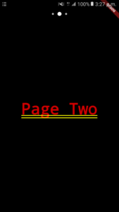
new Center(child: new Text("Page Two")),
new Center(child: new Text("Page Three"))
],
controller: controller,
)You can also customize Circle Indicator by changing arguments in its constructor.
new CircleIndicator(
    controller, 3, 6.0, Colors.white70, Colors.white
)class AboutPlaid extends StatelessWidget {
final PageController controller = new PageController();
@override
Widget build(BuildContext context) {
return new MaterialApp(
home: new Container(
padding: new EdgeInsets.only(
top: 16.0,
),
decoration: new BoxDecoration(color: Colors.black),
child: new Stack(
alignment: FractionalOffset.topCenter,
children: <Widget>[
new PageView(
children: <Widget>[
// You can have different Layouts/ Widgets in your app.
new Center(child: new Text("Page One",)),
new Center(child: new Text("Page Two")),
new Center(child: new Text("Page Three"))
],
controller: controller,
),
new Container(
margin: new EdgeInsets.only(
top: 16.0,
bottom: 16.0,
),
child: new CircleIndicator(
controller, 3, 6.0, Colors.white70, Colors.white)),
]),
));
}
}Currently, I am showing circle indicator dots on top of PageView. If you want to show these dots at the bottom of the page.
Change this line
alignment: FractionalOffset.topCenterto
alignment: FractionalOffset.bottomCenterCopy Right: http://developine.com/